



TL;DR
Power BI insights help businesses move from raw data to clear answers. By combining reliable data models, meaningful KPIs, the right visuals and useful context, Power BI can reveal trends, performance gaps, unusual changes and opportunities that are easy to miss in spreadsheets.
In today’s data-driven world, organizations collect more information than ever before. But there’s a catch—data alone doesn’t drive action. Insight does.
Raw numbers can overwhelm, confuse, or even mislead unless they’re shaped into a story that people can understand and act upon.
This is where Power BI comes in not just as a data visualization tool but as a powerful storytelling platform. For C-Suite leaders, Marketing Managers, and Heads of Digital, this means bridging the gap between numbers and narrative to make smarter decisions.
This guide explains what Power BI insights are, how to extract them, which visuals work best, how to design dashboards around business questions, and how to turn those insights into decisions.
The goal is not to build more charts. It is to make the important information easier to understand and act on.
When a dashboard tells users what changed, why it changed and what needs attention next, it becomes a decision-making tool rather than just a reporting screen.
Need clearer reporting your team can actually act on?
Book a free data insights meeting with Evangelist Apps and we will help you turn dashboards into useful decisions. (We have already done it for businesses like REC & others – check the case study pages!)
What are Power BI insights?
Power BI insights are meaningful findings identified from business data that help people understand performance, spot patterns and decide what to do next.
An insight is more useful than a number on its own. A KPI might tell you that revenue is down. An effective insight helps explain where the decline happened, how significant it is and which business area needs attention.
In practical terms, Power BI insights can help teams identify:
- Trends that are increasing or declining over time
- Performance differences between products, regions, teams or channels
- Unusual changes or anomalies
- Relationships between business metrics
- Results that are above or below a target
- Areas that require further investigation
Power BI can also generate insights automatically from supported data through its Insights and Quick Insights capabilities. Depending on the Power BI experience and data being analyzed, users can explore automatically surfaced patterns, trends and other findings rather than manually checking every visual.
Well-designed Power BI insights reduce interpretation effort and help decision-makers focus on outcomes, not dashboards.
Power BI Insights vs. Power BI Reports: Are they Same?
Np, they are not.
A Power BI report presents data. A Power BI insight explains why that data matters.
For example:
Report: Monthly sales fell from £1.2M to £980K.
Insight: Monthly sales fell 18%, with most of the decline coming from the UK enterprise segment.
Action: Review the enterprise pipeline, renewal activity and regional sales performance.
That difference is what makes a Power BI dashboard useful for business decision-making.
Power BI Data Insights: How to Extract Them?
Getting useful insights from Power BI starts before the first chart is created.
A dashboard cannot compensate for poor data, unclear metrics or a weak data model. A stronger approach is to move through four stages: prepare, analyze, visualize and explain.
1. Connect the right data sources
Start with data that actually supports the business question.
Depending on the use case, Power BI can bring together information from sources such as databases, spreadsheets, cloud platforms, business applications and other supported data sources.
Before connecting everything available, identify:
- Which data the business decision depends on
- Which metrics need to be measured
- Which data sources are reliable
- Which fields are unnecessary or duplicated
More data does not automatically create better insights.
2. Clean and model the data
Use Power Query and the Power BI data model to standardize data, resolve inconsistencies and create a structure that supports reliable analysis.
Pay particular attention to:
- Missing or inconsistent values
- Date and category formats
- Duplicate records
- Relationships between tables
- Measures and business definitions
- Consistent naming conventions
This stage is critical because an incorrect data model can produce an impressive-looking dashboard with misleading results.
3. Define meaningful measures and KPIs
Do not fill the report with every metric available.
Start with the questions decision-makers actually ask:
- Are we meeting the target?
- Which area is underperforming?
- What changed this month?
- Where is the biggest opportunity?
- Which segment is contributing most to growth?
- What needs attention first?
Then build KPIs and measures around those questions.
4. Use visuals to answer specific questions
Choose the visual based on the analytical task.
Use:
- Line charts for trends
- Bar and column charts for comparisons
- KPI cards for headline performance
- Tables and matrices for detailed analysis
- Scatter charts for relationships
- Funnel charts for staged processes
The visual should make the answer easier to see, not simply make the dashboard look more sophisticated.
5. Add context to the insight
A number without context often creates more questions.
Use clear titles, subtitles, tooltips, annotations, comparisons and conditional formatting to explain what users are looking at.
For example:
Weak: “Regional Sales”
Better: “West Region Sales Fell 14% in Q2”
The second version tells the reader immediately what changed and where to investigate.
Power BI Quick Insights
Power BI also provides a Quick Insights capability that can automatically analyze supported data and surface visual findings. Microsoft documents Quick Insights for semantic models as well as insights from dashboard tiles.
This can be useful when you want to discover patterns you may not have considered manually.
However, automatically generated insights should be treated as a starting point for analysis, not a replacement for business interpretation.
The important question is still:
Does this finding matter to the business, and what should happen next?
Why Storytelling with Data Matters for Businesses
Data storytelling matters because decision-makers rarely need more numbers. They need clarity.
- A finance leader may want to know why revenue changed.
- A sales leader may want to know which region is missing target.
- A marketing manager may want to know which channel is driving quality leads.
- A digital leader may want to understand where customer behavior is changing.
The dashboard becomes more valuable when it answers those questions in a logical sequence.
A useful data story typically moves from:
What happened → Where did it happen → Why might it have happened → What should we investigate or do next?
Power BI supports this by combining interactive reports, filters, drill-throughs, KPIs and visual analysis into a single reporting experience.
The objective is not to make data more decorative.
It is to make important information easier to understand and easier to act on.
Choose the Right Visuals for Power BI Insights
The best Power BI visual is the one that makes the intended insight immediately understandable.
A visually impressive dashboard can still fail if the wrong chart is used or too much information competes for attention.
Here are some visual storytelling principles:
| Visual Type | Best Use Case | When to Use It |
|---|---|---|
| Line Chart | Trends over time | Monthly or yearly performance tracking |
| Bar / Column Chart | Category comparison | Comparing products, regions, or teams |
| KPI Card | High-level performance metrics | Executive summaries and dashboards |
| Table / Matrix | Detailed breakdowns | Operational analysis and audits |
| Scatter Chart | Correlation analysis | Identifying relationships between variables |
| Funnel Chart | Stage-based conversion analysis | Sales or marketing pipelines |
Use KPI Cards for the Big Picture
KPI cards work best when users need an immediate view of a small number of important metrics.
Examples include:
- Revenue
- Gross margin
- Customer churn
- Conversion rate
- Customer acquisition cost
- Sales pipeline
Avoid filling the top of the dashboard with dozens of KPIs.
The first screen should help users understand the business situation quickly.
Use Trend Visuals to Show Change
A single number shows the current state.
A trend shows direction.
Whenever performance changes over time, use an appropriate time-based visual so users can distinguish between:
- A temporary fluctuation
- A sustained decline
- Seasonal movement
- A growth trend
- A sudden change that needs investigation
Use Comparison Visuals to Find Outliers
Bar and column charts are useful when the question is about differences.
For example:
- Which region performs best?
- Which product contributes most revenue?
- Which team has the lowest conversion rate?
Comparisons often turn a large dataset into a much smaller list of priorities.
Use Detailed Tables Only When They Add Value
Tables and matrices are useful for operational analysis, but they should not become the default visual for every dashboard.
Use them when someone needs to inspect individual records, categories or combinations of metrics after the higher-level insight has been identified.
Pro Tip
Do not start by asking:
“Which chart should I use?”
Start with:
“What business question does this visual need to answer?”
Then choose the visual that makes that answer easiest to see.
Real-World Example: Power BI Insights for REC
The Recruitment & Employment Confederation (REC) needed better visibility into Microsoft Teams call and meeting activity. Their reporting relied on manual spreadsheets, making it slow, inconsistent, and difficult to extract meaningful insights.
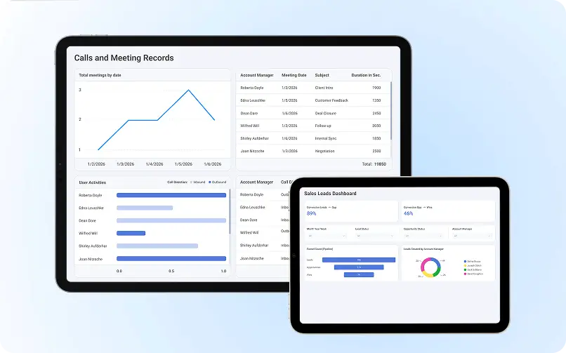
Evangelist Apps, one of UK’s leading business intelligence services provider, designed an automated reporting solution using Power BI and SQL, bringing Teams call and meeting data into a centralized reporting environment.
The resulting dashboards provided visibility into metrics such as:
- Total calls
- Meeting duration
- User activity
- Trends over time
- Summary-level performance
The solution helped REC team:
- Reduce manual spreadsheet-based reporting
- Improve visibility into communication activity
- Create more consistent reporting
- Give leadership clearer access to actionable information
The important lesson is that the value was not created simply by putting the data into Power BI.
The value came from turning fragmented operational data into a structured reporting experience that leadership could actually use.
That is the difference between reporting data and creating Power BI insights.
Read the full [REC case study] to see how Evangelist Apps approached the reporting challenge.
Book a free consulting call with us to discuss your data visualization project.
How to Design Power BI Dashboards That Drive Understanding
Good Power BI dashboard design should reduce the effort required to find an answer.
1. Start With One Primary Business Question
Each dashboard page should have a clear purpose.
Examples:
- How are we performing against target?
- Where are sales declining?
- Which products are growing?
- Where are customers dropping out?
- Which operational areas need attention?
A focused dashboard is easier to interpret than a page containing unrelated metrics.
2. Put the Most Important Insight First
Use a clear visual hierarchy.
A practical structure is:
- Top: headline KPIs and key status indicators
- Middle: trends, comparisons and major findings
- Bottom: detailed analysis and drill-down information
This gives users a natural path from summary to explanation.
3. Keep Visuals Consistent
Use a consistent approach to:
- Titles
- Labels
- Fonts
- Number formats
- Spacing
- Filters
- Status indicators
Consistency helps users focus on the insight rather than learning the dashboard interface.
4. Avoid Unnecessary Complexity
Do not add a visual simply because Power BI makes it available. Remove charts that do not contribute to a business question.
A smaller number of useful visuals is usually more effective than a dashboard crowded with information.
5. Design for Accessibility
Make dashboards easier to use by considering:
- Sufficient contrast
- Clear labels
- Readable text
- Meaningful chart titles
- Alternatives to color-only indicators
Do not rely entirely on red and green to communicate an important business state.
6. Design the Mobile Experience
Business users may review reports away from their desktops.
Important KPIs and insights should remain understandable on smaller screens, with unnecessary detail pushed lower in the information hierarchy.
From Reports to Guided Insights: Adding Context
A report becomes much more useful when it helps the reader understand what they are seeing.
Tip #1) Use Action-Oriented Titles
Instead of: “Sales Performance”
Try: “Enterprise Sales Fell 12% in Q2”
Instead of: “Customer Churn”
Try: “Churn Increased Most Among Mid-Market Customers”
Specific titles reduce the amount of interpretation required from the reader.
Tip #2) Use Tooltips for Supporting Context
Tooltips can provide additional information without overcrowding the main dashboard.
Use them for:
- Definitions
- Supporting metrics
- Comparisons
- Additional segments
- Explanations of unusual changes
Tip #3) Use Drill-Throughs to Investigate the Why
A summary dashboard should not try to show everything.
Use drill-through pages to let users move from:
Overall performance → Segment → Region → Product → Individual detail
This creates a more useful analytical path.
Bookmarks can support guided experiences, but they should serve a clear purpose.
Use them to move between views, compare scenarios or expose deeper analysis rather than adding interaction simply for visual effect.
Tip #5) Make the Next Action Clear
The strongest dashboard does more than identify a problem.
It helps users understand where to look next.
For example:
Insight: Conversion dropped 9%.
Context: Most of the decline came from paid search traffic.
Next step: Review campaign-level conversion rates and landing-page performance.
That is where reporting starts becoming decision support.
Final Thoughts: Turning Data Into Actionable Stories
Power BI is most valuable when it helps people move from data to understanding, and from understanding to action.
The objective of an effective dashboard is not to display everything the business knows. It is to surface what matters.
That means:
- Use reliable data
- Define meaningful KPIs
- Choose visuals based on business questions
- Add context to important changes
- Make the most important insight visible first
- Give users a clear path to deeper analysis
A strong Power BI dashboard should make someone pause and say:
“Now I understand what is happening — and I know what I need to investigate next.”
That is the real value of Power BI insights.
Evangelist Apps helps businesses build data and business intelligence solutions that turn complex operational data into clearer reporting and decision support.
If you are planning to choose a Power Bi developer, contact Evangelist Apps today.
F.A.Q: Power BI Insights
Q. What are Power BI insights?
Power BI insights are actionable findings derived from data that highlight trends, performance gaps, and anomalies. They help decision-makers quickly understand what is happening in the business and where action is required.
Q. How do you generate data insights in Power BI?
Data insights in Power BI are generated by cleaning and modeling data, defining meaningful metrics, and using the right visuals. Clear titles, context, and comparisons turn raw data into understandable insights.
Q. What makes insights in Power BI actionable?
Insights in Power BI become actionable when dashboards provide context and direction. This includes focused KPIs, clear explanations, conditional formatting, and drill-through views that show what changed and why it matters.
Q. Which visuals are best for Power BI insights?
The best visuals for Power BI insights depend on the question being answered. Line charts show trends, bar charts support comparisons, KPI cards highlight performance, and tables provide detailed breakdowns when needed.
Q. How many KPIs should a Power BI dashboard include?
A Power BI dashboard should include three to five core KPIs per view. This keeps insights focused, reduces cognitive overload, and helps users make decisions faster.
Q. How does Power BI support data storytelling?
Power BI supports data storytelling by structuring dashboards as a guided narrative. Visual hierarchy, filters, and drill-down paths help users move from high-level summaries to detailed insights logically.
Q. What is business intelligence consulting?
Business intelligence consulting turns raw data into dashboards, KPIs, and decisions. The best consulting services focus on clarity, context, and action – not just visual charts